
This year, the NFL and Nike announced the new NFL Rivalries uniform set. This new set of football uniforms would bring a new theme to 8 teams in the NFL. The teams in the AFC East and NFC West will wear the uniforms once this season, and a few have already. We are going to rank these uniforms from worst to best with a ranking system including the helmet, jersey, theme, and creativity.
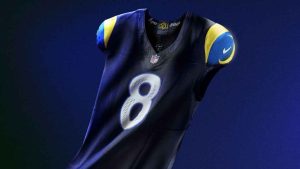
8. Los Angeles Rams: ‘Midnight Mode’
To be worn on November 16 vs. Seahawks
Helmet: 1.5/5
Jersey: 1/5
Theme: 1.5/5
Creativity: 1/5
Overall: 5/20
This new Rams uniform is supposed to show the colors surrounding Los Angeles at night. The design of the uniform is the exact same as their regular uniform, just the main color has been swapped with “midnight navy”. But, this navy looks exactly like black, and playing in the domed SoFi Stadium it will not look good with a dark uniform theme. Also, wearing a uniform called ‘Midnight Mode’ during the day is a horrible idea. There is no creativity whatsoever, with no extra designs added on and just the ram horns on the sleeves. Despite all the hype for this uniform, it has turned out to be a big disappointment.
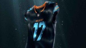
7. Miami Dolphins: ‘Dark Water’
Worn on September 29 vs. Jets
Helmet: 1.5/5
Jersey: 2/5
Theme:1/5
Creativity:1/5
Overall: 5.5/20
The Dolphins’ uniform is another blackout uniform made in the Rivalries series. It is, just like the Rams, a white jersey template with the white switched out for black. It just edged out the Rams because we like the bright turquoise numbers. The theme doesn’t really make sense, with “stripes” that are a tribute to the team’s speed in De’Von Achane and Tyreek Hill, and is supposed to also show how dolphins will move fast in waters. Unfortunately, the whole part about Hill didn’t work well, because he suffered a dislocated kneecap, torn ACL, and ligament injuries in this jersey. Overall, this jersey wasn’t the best, and it lacked a lot of creativity.
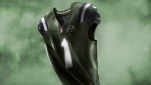
6. New York Jets: ‘Gotham City Football’
To be worn on December 7 vs. Dolphins
Helmet: 1/5
Jersey: 1/5
Theme: 2/5
Creativity: 2/5
Overall: 6/20
New York’s uniform just edged out the Dolphins for the 6th spot. The idea is great of ‘Gotham City’, but the color scheme just doesn’t really look right. The helmet seems extremely bland, similar to a regular helmet with the classic Jets logo on it, and the jerseys have a cool look, but the colors just don’t seem to fit. The pretty solid theme is what moves the Jets up from being in 7th place, but we just don’t see this turning into a great overall uniform.
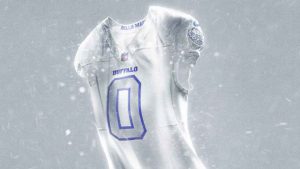
T4. Buffalo Bills: ‘Cold Front’
Worn on October 5 vs. Patriots
Helmet: 4/5
Jersey: 3/5
Theme: 3.5/5
Creativity: 3/5
Overall: 13.5/20
The Bills made the ‘Cold Front’ uniforms as a tribute to the snowy weather in Buffalo, New York. It is a whiteout uniform that takes all the red out of the jersey. It relies heavily on the silver, and up close, you can see cracked ice designs on the top of the helmet and pants. The real problem with this uniform is that from a distance, it looks like a big mess of white and silver with no outlines on numbers or anything else. This wasn’t as creative as teams like the Cardinals and Patriots, but it looks really nice up close.
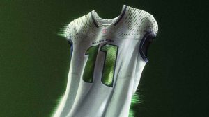
T4. Seattle Seahawks: ‘High-Decibel Zone’
To be worn on December 18 vs. Rams
 Helmet: 2/5
Jersey: 3.5/5
Theme: 4.5/5
Creativity: 3.5/5
Overall: 13.5/20
The Seattle Seahawks made the ‘High-Decibel Zone’ uniforms as a tribute to their fans, the “12s”, and the sound they create at Lumen Field every gameday as one of the loudest stadiums in the world. There is a sound wave design on the shoulders, and the number is a shiny green. This design kind of looks like an Oregon Ducks knockoff, but the jersey looks pretty fresh. The only real problem is the helmet, which looks a lot like the regular one, just a little bit shinier. Overall, this is a good jersey, and we like the look.
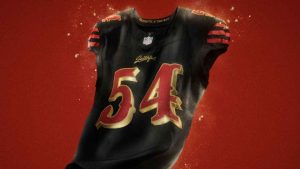
3. San Francisco 49ers: ‘For the Faithful’
To be worn on January 4 vs. Seahawks
Helmet: 4.5/5
Jersey: 4.5/5
Theme: 4/5
Creativity: 4/5
Overall:17/20
The 49ers made the ‘For the Faithful’ uniforms as a gift to their fans, the “Faithful”, which can be seen in the embroidery on the chest and collar piece. It is a blackout design, and the 49ers did an excellent job showing the gold on the uniform. The numbers are an old saloon font, and the helmet has the regular design, just with a gold face mask and a black coloring. Recently, San Francisco had a brand refresh, connecting to the Bay Area, and this involves the Gold Rush in its theme. Overall, this uniform is a solid 3rd place in our rankings.
2. Arizona Cardinals: ‘Built to Last’
Worn on September 25 vs. Seahawks

Helmet: 4/5
Jersey: 4.5/5
Theme: 5/5
Creativity: 4.5/5
Overall: 18/20
The Cardinals’ theme here was to have a jersey that connects to the desert and sandstorms that occur in Arizona, and they did it perfectly. It has a speckled texture to represent these storms, and the color just looks nice. The colors of the logo were also just slightly tweaked, giving the look a more desert feel. This is really creative, and in the game the end zone had the Arizona flag painted on it, rounding out the theme perfectly. The jersey also had an impressive shoulder patch with a copper state outline. This was a great looking uniform against the Seahawks, and it fell just short of coming in 1st place.
1. New England Patriots: ‘Nor’Easter’
To be worn on November 13 vs. Jets
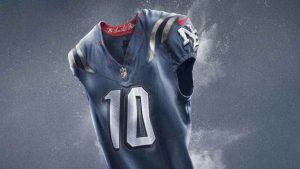
Helmet: 5/5
Jersey: 5/5
Theme: 4.5/5
Creativity: 4.5/5
Overall: 19/20
The first thing we said when we first saw this New England jersey is, “this is outstanding.” The Patriots connected to all of New England and the six states that are in it. There are six red stars around the collar. It has good looking numbers, and the shade of blue that takes up most of the jersey is just immaculate. The gray stripes on the shoulders make it even better. Lots of people have wanted the Patriots to wear white helmets that aren’t Patriot throwbacks, so this is just perfect. Rounding out the look for the Pats, is their best-looking silver pants which just add on to the greatness!