

Academy’s New Logo Sparks Backlash
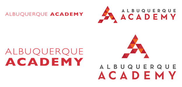
The school’s old and new nameplate and logo.
On October 12, Albuquerque Academy Head of School Julianne Puente unveiled the school’s new logo. The announcement was immediately met with backlash from the community, with many saying that it caught them off-guard and has left some wondering why the school’s administration never asked for student input when creating the logo. In addition, there have been claims that the logo isn’t necessarily visually appealing and doesn’t reflect the Academy community. Some have commented that the new administration is changing too many things too quickly, referring to the new schoolwide schedule implemented this year. This criticism came to a head with a petition created by two anonymous community members, hoping that the school’s administration may listen to their concerns and change the logo back to its original version.
Last spring, the school’s leadership team, which included Head of School Julianne Puente, Associate Head of School Stephanie Lipkowitz, Chief Financial Officer Bruce Orem, and Director of Communications, Becky Richards, began working on creating a new logo. The logo was created by an outside ad firm, K2MD. The school’s official announcement states, “Throughout the process, it came up again and again that Academy is Albuquerque. The new mark…represents our commitment to bold education in New Mexico. The design echoes the Southwest…[and] the open spaces honor those who have yet to join our community.”
However, the design has rubbed many the wrong way. One anonymous student said, “Nothing about it feels like Academy. The new logo was unnecessary.” Another anonymous student said, “Though it seems like it incorporates traditional New Mexican art and pays homage to our culture, I don’t necessarily agree with the entire message. The logo could’ve been more simplistic in my opinion, or at least should’ve had some community contribution and input before making a final decision.” Some in our community went a step further and created a petition to revert back to the original logo. One anonymous community member commented on the petition, “…it feels like a betrayal by the school to the student community. [Administration] spends a lot of time preaching about Charger pride, but when they do something that greatly impacts the student body they don’t tell us, keeping it under wraps and then revealing it through an abrupt and unexpected email. Not to mention that if they wanted to design a new logo they should have taken advantage of the fantastic student artists we have at our school.”
To get to the bottom of this controversy, The Advocate went straight to the source: Ms. Puente. She stressed that she wanted to create a “cohesive aesthetic,” saying that she counted 8 different “As” being used around campus. She remains adamant that the logo wasn’t changed, rather something was merely added to it that enhances the nameplate and doesn’t replace the school seal, the Charger, or the varsity A. She says that the old logo wasn’t scalable, meaning that it couldn’t be used in many places, like shirts and bumper stickers. Ms. Puente believes that the new logo can be used in a variety of applications. Asked about those who would’ve liked some community input in the decision, she said, “Not every decision is made by the community. This isn’t a contest. To say that we were thoughtless [or] uncaring doesn’t make a lot of sense to me.” When pressed on criticism that the symbolism behind the new design is unclear, she said, “I don’t have to explain every move. This wasn’t done haphazardly,” but also emphasized that she wrote up an announcement to the community when the new logo was launched. However, she remains open to “changing, altering, or discontinuing” the logo if it stops serving its purpose.
The first place you can expect to see the logo is in the campus’ directional signage, “a project driven by the need for improved usability.” As for now, it seems that the logo won’t be changed unless the community can drum up more support to force the administration to reverse its decision. Ms. Puente believes that “If people took the time to learn about it, they’d feel better about the change.”

Uzair Hammad '24 has been a writer and editor for The Advocate for four years, finally ascending to the fabled position of editor-in-chief. In his free...


Olaf Sleipnir • Nov 17, 2021 at 10:53 am
The New Albuquerque Academy Logo Is a Symbol of Anger. “Anger is never without a reason, but seldom a good one.” -Benjamin Franklin
https://medium.com/@olafsleipnir/the-new-albuquerque-academy-logo-1aa22c441367?sk=48ff7f50b81c47573c4e4447fad8d389
Bryce Baker • Nov 12, 2021 at 8:06 pm
I would like to go through my reasons why, from a purely graphic design standpoint, the problems with the new logo;
1. The decision to use the colors, red and orange, do not make much sense to me when you consider what this logo represents. The school colors are red and black, and I honestly find it quite surprising that these colors were not used. Not only would it have represented the school better, but it most likely would’ve looked better too, as the shades used in the logo are a little too samey, as I’m sure many would agree.
2. If you want to do something interesting to a base design for a logo (in this case the ‘A’, and the interesting aspect being the removal of some of the triangles), then it needs to be obvious why you went for what you went for. While the official reason for the removed triangles is that it represents people who haven’t joined the community, it is not obvious at all that this is the case just by looking at it. However, another problem is that the logo is supposed to represent, well, our community, and if you are not part of the community you are… not part of the community.
3. This logo is not particularly more scalable than a piece of text, as Ms. Puente mentions in this article. Text can be easily scaled onto any size just as this new logo can. But so can many things. Even the charger could be easily scaled if it was simply recreated as a vector file in Photoshop, and it would look just as good on a wall as it would on a postcard.
I could comment on the other mistakes made with this change, but even just going from a graphic design standpoint, this seems like a silly change in my view. Particularly, this logo fails in being appealing to the eyes, which is a huge problem. Mostly because of the removed triangles, which in my opinion, is the worst aspect of this logo.
Hammad Irshad • Nov 5, 2021 at 9:40 pm
Nicely written article. I would have expected a different response to this change from the AA student community as they are generally considered a progressive bunch. There is always going to be some resistance to change but come on!
This seems to me a rebranding effort on part of school. However, some input from the students could not have hurt.
Anonymous • Nov 3, 2021 at 3:45 pm
Petition link: https://www.change.org/p/albuquerque-academy-board-and-staff-uniting-the-community-through-the-school-logo
Liz Payne • Nov 3, 2021 at 3:06 pm
Thanks for the great article, Mr. Hammad. I scrolled through the comments on the petition and was disappointed to read our students’ (often cruel) notes. I think they are a poor representation of the kind of thoughtful critical feedback that our students are capable of giving.
Jiniu • Nov 3, 2021 at 2:32 pm
i actually like the new logo lol